Contents
- Index
Pareto Chart Window
The Pareto Chart window is a child window for displaying information about the relative contribution of each of the individual input variables to the tolerance of an output variable. The results displayed in this window are the results of performing a sensitivity analysis. It is displayed by clicking on the  button on the toolbar or by selecting the Pareto Chart menu item from the
 Analysis menu. Click on the X in the upper right corner to close this window.
The Pareto Chart window automatically updates itself when information affecting the displayed results is changed. When the program is in immediate update mode, the updates occur immediately following the change being made. If the program is in delayed update mode, the Pareto Chart window draws a red X through itself when it is not current. Clicking on the window will cause it to update and redraw itself. The update mode is selected using the Options menu.
Double clicking a variable name or symbol in the window results in the appropriate variable dialog box being displayed so that the variable can be edited. This is a short cut to selecting the Edit menu item from the Variables menu.
There are four tabs displaying the results:
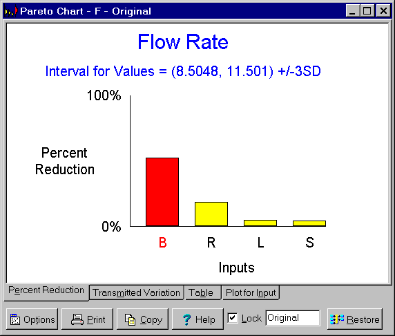
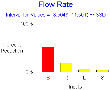
Tab 1 - Percent Reduction: Graphically displays the percent reduction in the width of interval for values of the output variable that results from tightening the tolerances for each of the individual input variables. The original interval for values of the output variable is shown at the top and is the same as shown on the Capability Study window. The inputs are listed in order of importance. For example, B has the largest effect. Tightening its tolerance can shorten the interval for values for the output by about 50%. For exact values, see the third tab.
Tab 2 - Transmitted Variation: Graphically displays the variation transmitted by each input variable to the output variable along with the total variation of the output variable. The interval for values of the output variable is shown at the top and is the same as shown on the Capability Study window. The figure at the right of the chart represents this interval. The figures for the inputs represent the variation transmitted by each input individually, not taking into account interactions. The inputs are listed in order of importance. For exact values, see the third tab.

Tab 3 - Table: Displays in tabular form both the transmitted variation and percent reduction in the total variation of each input variable. The interval for values of the output variable is shown at the top and is the same as shown on the Capability Study window. Each row in the table shows the results of setting that's input tolerance width to zero, while leaving all the other inputs' tolerances at their original values. The resulting interval for values for the output variable is shown along with the percent reduction in the width of the original interval for values. Also shown is the transmitted variation for each input. This the width of the resulting interval for values for the output due to a single input variable alone. The values in this table were used to construct the graphics on first two tabs.

Tab 4 - Plot for Input: Displays a plot of the effect of tightening the tolerance of one of the inputs on the width of interval for values of the output variable. The input plotted is initially that having the largest effect. The input plotted can be changed using the Input to Plot menu item on the associated popup menu. This popup menu is displayed by clicking the Options button or right mouse clicking over the plot. For worst case tolerances, the plots are linear. For statistical and process tolerances, the plots are curved.

In both the table and graphics, the inputs are listed in order of importance. The top or left most inputs have the largest effects. If tolerances must be tightened, these are the inputs one should begin with. Of course one should also consider the costs associated with tightening each tolerance to obtain the best value.
The percent reductions do not add up to 100% because of the non-additive nature of variation. To obtain reductions greater than is possible by tightening the tolerances of individual inputs requires tightening the tolerances for several inputs simultaneously.
The buttons and controls at the bottom can be hidden by removing the check from the Show Buttons menu item on the Options menu. When hidden, the popup menu can still be used to perform the functions of these buttons and controls. The following buttons and controls are available:
 Clicking this button displays the popup menu below associated with this window. This popup menu has menu items that correspond to each of the buttons and controls shown at the bottom of the window. It also has items that can be used to change how the graphic is sized within the window. A short cut is to right mouse click on the graphic.

 Prints the graphic on the selected tab. Shortcuts are to click the Print button on the toolbar or to select the Print menu item on the
 File menu.
 Copies the graphic on the selected tab to the clipboard. Shortcuts are to click the Copy to Clipboard button on the toolbar or to select the Copy to Clipboard menu item on the
 File menu.
 Displays help on using this window. Short cut is to press F1 key.
Lock check box: Checking this box locks the window so that it does not update as changes are made to the variables. Locking the window causes a complete copy of the I/O System to be saved. It also causes the Restore button to be displayed which can be used to restore the I/O System to the state it was in when the Lock check box was clicked. Unlocking a window deletes the saved copy of the I/O System.
Note edit box: Used to enter a note that appears on the caption bar. Primarily intended to be used when the window is locked to describe the version of the design being displayed.
 This button is only displayed when the window is locked. Clicking it restores the I/O System to the exact state it was in when this window was locked.